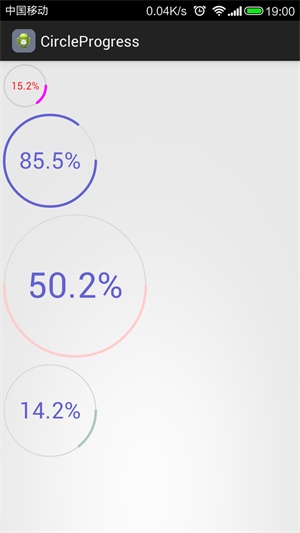
和上一篇博客一样,本篇博客也是为了练习Android绘图操作而产生的,使用了基本的绘图操作,实现了一个圆形进度条。老规矩,在介绍之前,先来看看效果图。一共有四个不同属性的圆形进度条,外围是进度,中间文字显示当前进度,其中,文字颜色,进度条宽度及颜色均可以在xml中使用属性配置也可使用调用响应方法改变。
圆形进度条的实现
- 确定进度条的大小
确定控件大小是在onMeasure()中决定的,所以我们在onMeasure中调用默认的测量方法,然后获取测量的结果,取宽高之间的最小值作为显示圆形的矩形边长。
/**
 * 先调用默认的测量方法,然后根据测量结果初始化绘制范围
 */
@Override
protected void onMeasure(int widthMeasureSpec, int heightMeasureSpec) {
	super.onMeasure(widthMeasureSpec, heightMeasureSpec);
	int width = getMeasuredWidth() - getPaddingRight() - getPaddingLeft();
	int height = getMeasuredHeight() - getPaddingTop() - getPaddingBottom();
	// 让进度条居中,并且取较小的一边为进度条的矩形区域边长
	int length = Math.min(width, height);
	int top = (height - length) / 2;
	int left = (width - length) / 2;
	mRect.set(left, top, left + length, top + length);
	// 设置一个边距
	mRect.inset(10, 10);
}
- 确定文字大小和位置
由于前面已经获得了圆形控件显示的矩形,下面只需要让文字显示在这个矩形的正中间就行了,首先是水平居中,(矩形宽度-文字长度)/2这样就可以计算出文字的左边距,对于上边距,也就是垂直居中,类似,使用(矩形高度-文字高度)/2,即可以计算出文字的上边距,可是这里有一个问题。绘制文字的时候,Y方向上是采用基线对齐的,所以我们需要转换一下,计算出基线的位置。见代码,关于文字基线以及转换方法请参见Android drawText详解。
/**
 * 绘制文字
 */
private void drawText(Canvas canvas, String text) {
	mPaintText.setAntiAlias(true);
	mPaintText.setStyle(Paint.Style.FILL);
	mPaintText.setStrokeWidth(1);
	mPaintText.setColor(mTextColor);
	mTextSize = (int) (mRect.width() / 4);
	mPaintText.setTextSize(mTextSize);
	//获取左边距
	float textLeft = (getMeasuredWidth() - mPaintText.measureText(text)) / 2;
	FontMetrics fontMetrics = mPaintText.getFontMetrics();
	float textTop = (getMeasuredHeight() - (fontMetrics.descent - fontMetrics.ascent)) / 2;
	// 转化为基线位置
	textTop = textTop - fontMetrics.ascent;
	canvas.drawText(text, textLeft, textTop, mPaintText);
}
- 绘制圆形进度条控件
绘制圆形进度条控件只是采用基本的图形绘制而已。首先绘制背景圆圈。然后根据进度计算出角度,绘制弧线,这样就绘制出了圆形进度,而绘制文字在上面已近贴出了,就不在重复贴出了。
@Override
protected void onDraw(Canvas canvas) {
	mPaintProgress.setStrokeCap(Paint.Cap.ROUND);
	mPaintProgress.setStyle(Paint.Style.STROKE);
	mPaintProgress.setAntiAlias(true);
	// 绘制未完成颜色
	mPaintProgress.setStrokeWidth(mProgressWidth / 2);
	mPaintProgress.setColor(mUnFinishColor);
	canvas.drawCircle(mRect.centerX(), mRect.centerY(), mRect.width() / 2,
			mPaintProgress);
	// 绘制已完成颜色
	mPaintProgress.setStrokeWidth(mProgressWidth);
	mPaintProgress.setColor(mFinishColor);
	canvas.drawArc(mRect, 0.0f, mNowProgress / MaxProgress * 360, false,
			mPaintProgress);
	// 绘制进度文字
	drawText(canvas,
			String.format("%3.1f", mNowProgress / MaxProgress * 100) + "%");
}
- 获取xml定义的属性
关于自定义属性,可以参看Android自定义属性。首先编写配置文件
<?xml version="1.0" encoding="utf-8"?>
<resources>
    <declare-styleable name="CircleProgressBar">
        <attr name="finish_color" format="color|reference" />
        <attr name="unfinish_color" format="color|reference" />
        <attr name="text_color" format="color|reference" />
        <attr name="stroke_width" format="dimension|integer" />
        <attr name="max_progress" format="integer" />
    </declare-styleable>
</resources>
在布局文件中使用上面的属性
<com.jay.circleprogress.CircleProgressBar
    android:id="@+id/pro1"
    android:layout_width="60dp"
    android:layout_height="60dp"
    jay:finish_color="#ff00ff"
    jay:text_color="#ff0000"
    jay:unfinish_color="#cdcdcd" />
在代码中获取定义的属性值
public CircleProgressBar(Context context, AttributeSet attrs, int defStyle) {
	super(context, attrs, defStyle);
	TypedArray typeArray = context.obtainStyledAttributes(attrs,
			R.styleable.CircleProgressBar, defStyle, 0);
	int count = typeArray.getIndexCount();
	for (int i = 0; i < count; i++) {
		switch (typeArray.getIndex(i)) {
		case R.styleable.CircleProgressBar_finish_color:
			mFinishColor = typeArray.getColor(i, 0xff6463D0);
			break;
		case R.styleable.CircleProgressBar_unfinish_color:
			mUnFinishColor = typeArray.getColor(i, 0xffdbdbdb);
			break;
		case R.styleable.CircleProgressBar_text_color:
			mTextColor = typeArray.getColor(i, 0xff6463D0);
			break;
		case R.styleable.CircleProgressBar_max_progress:
			MaxProgress = typeArray.getIndex(i);
			break;
		case R.styleable.CircleProgressBar_stroke_width:
			mProgressWidth = typeArray.getInt(i, 6);
			break;
		}
	}
	typeArray.recycle();
}
个人觉得本例中唯一的难点就是文字大小的自适应和文字绘制的位置,不过细心点还是很好就算出来的。
源码下载 : 360云盘 访问密码 5b06